Soothing Zone, human-pet coexistence brand
Industry: E-commerce
Duration: 1 months
Role: Brand and Packaging Designer
Deliverable: Brand Guide | Packaging Design
Be closer to everything you love, in everyday moments.
Smoothing Zone is a lifestyle brand concept rooted in the idea of human-pet coexistence.
The project explores how branding and visual identity can communicate trust, emotional safety, and quiet companionship
Smoothing Zone translates that lived experience into a brand system that celebrates patience, shared presence, and the simple goal of “living together.”

Problem
Urban pet owners lives in high-density cities often experience:
Emotional exhaustion from fast-paced, efficiency-driven lifestyles
Visual overload from excessive information and stimulation
A lack of lifestyle brands that feel quietly trustworthy rather than overly commercial or sentimental
At the same time, many pet-related brands lean heavily toward either:
Highly commercial pet supply aesthetics, or
Overly cute, character-driven visuals that don’t align with modern interior or lifestyle preferences
The challenge:
How might a brand visually express trust-building, calm, and coexistence without noise, guilt, or over-design?
Brand Intent
Smoothing Zone was designed around three core beliefs:
Coexistence over control
Living together means adjusting, observing, and respecting boundaries—on both sides.The value of slow relationship-building
Trust is built through time, repetition, and consistency, not instant results.A shared goal: to live on
Beyond comfort or aesthetics, coexistence is about commitment and continuity.
Business Goals
Establish a credible lifestyle brand grounded in emotional authenticity
Create a brand system that feels ready for collaboration, funding, or platform support
Deliver a launch-ready visual identity within one month
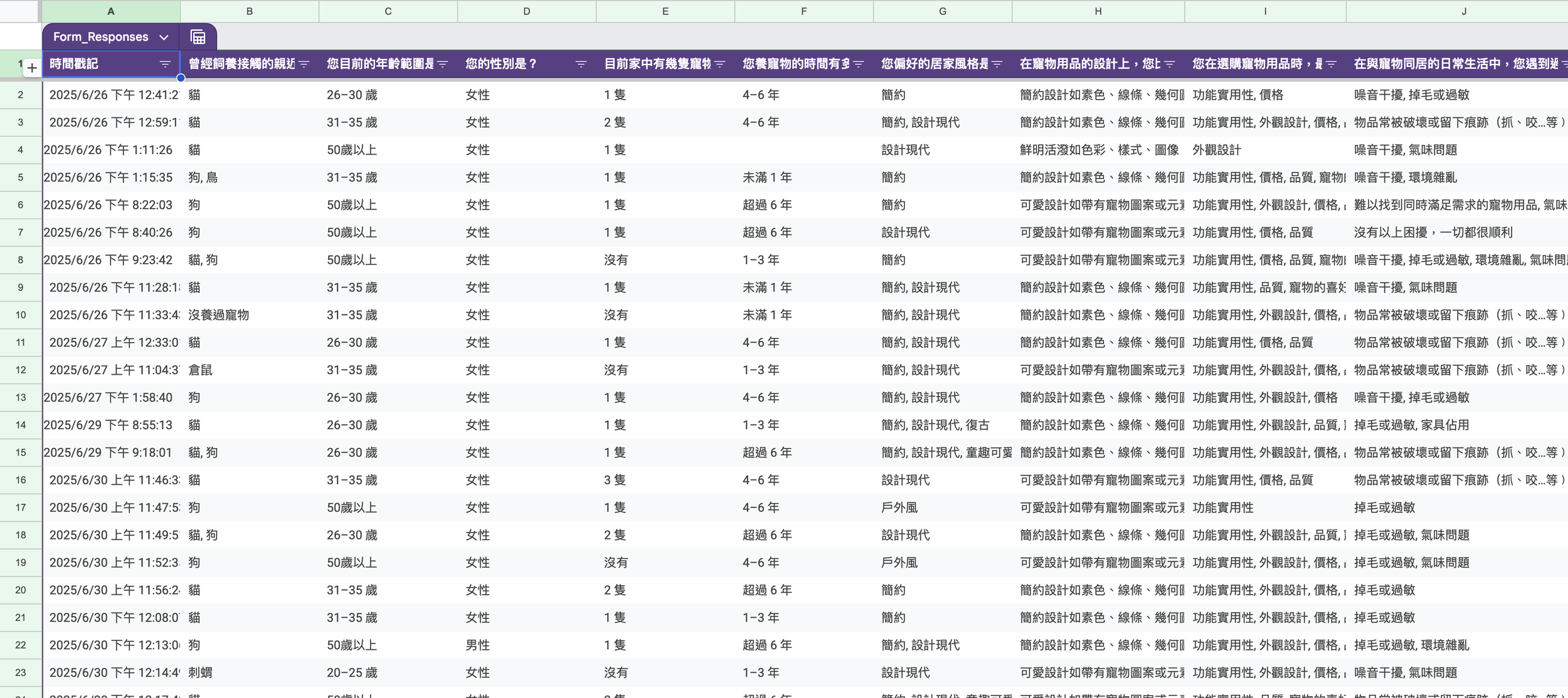
User Research & Insights
Research focused on potential users in Taiwan, with insights strongly aligned with broader East Asian urban aesthetics.
Key findings:
After returning home from busy, information-heavy cities, users prioritize rest, visual calm, and emotional decompression
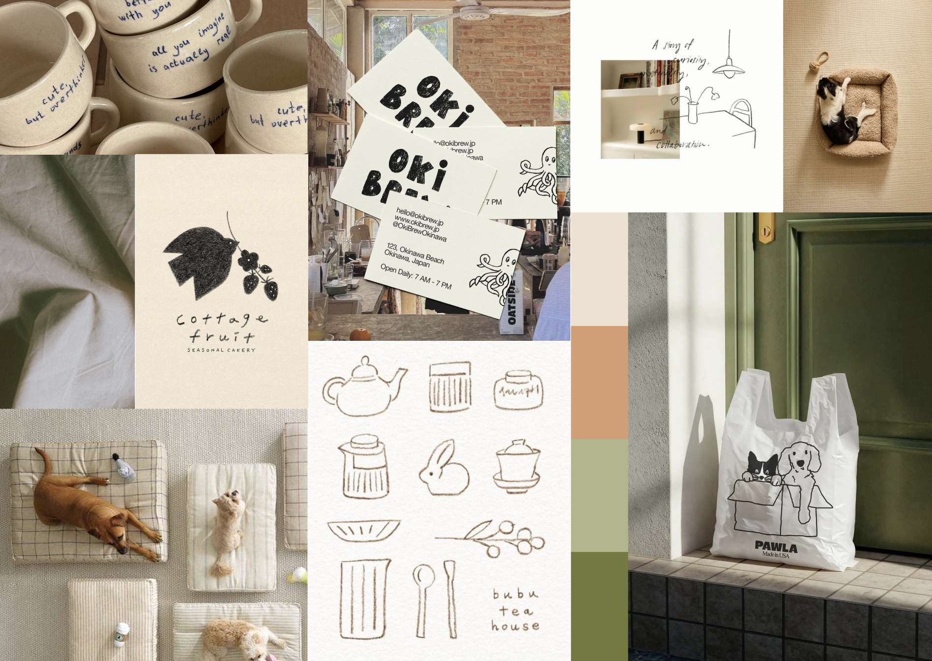
Strong aesthetic influence from Japanese and Korean media, advertising, and lifestyle brands
Visual preferences include:
Neutral or solid color palettes
Clean lines and geometric forms
Minimalist compositions
Soft, restrained “cuteness” through subtle pet-related motifs rather than overt illustrations
Insight:
Users are not looking for more stimulation, they are looking for a visual environment that slows them down.
Visual Strategy
The visual system for Smoothing Zone was designed to feel:
Calm, stable, and breathable
Emotionally warm but visually restrained
Contemporary, minimal, and interior-friendly
Design Principles
Reduction over decoration: every element must earn its place
Soft geometry: rounded or balanced forms to signal safety
Negative space as comfort: silence is part of the design
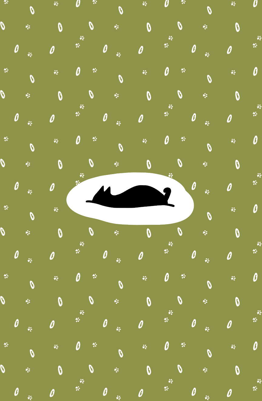
Subtle pet presence: animals are implied, not cartooned
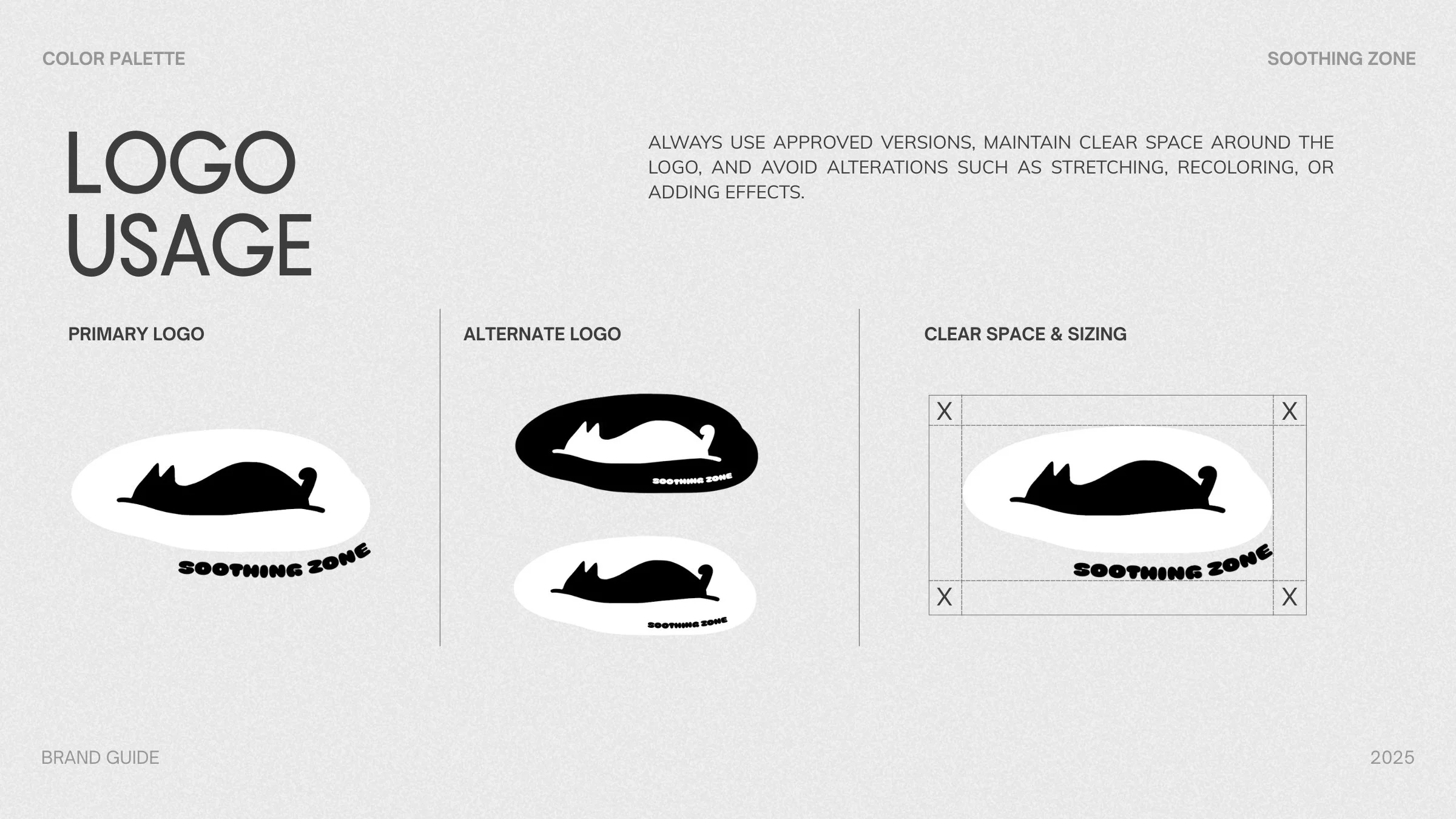
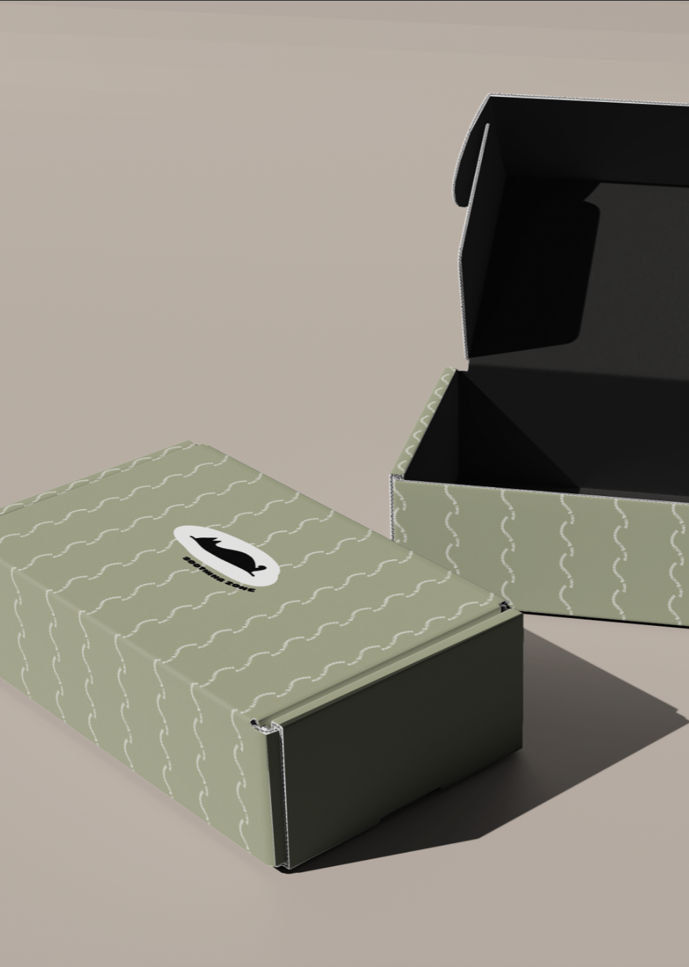
Brand Identity System
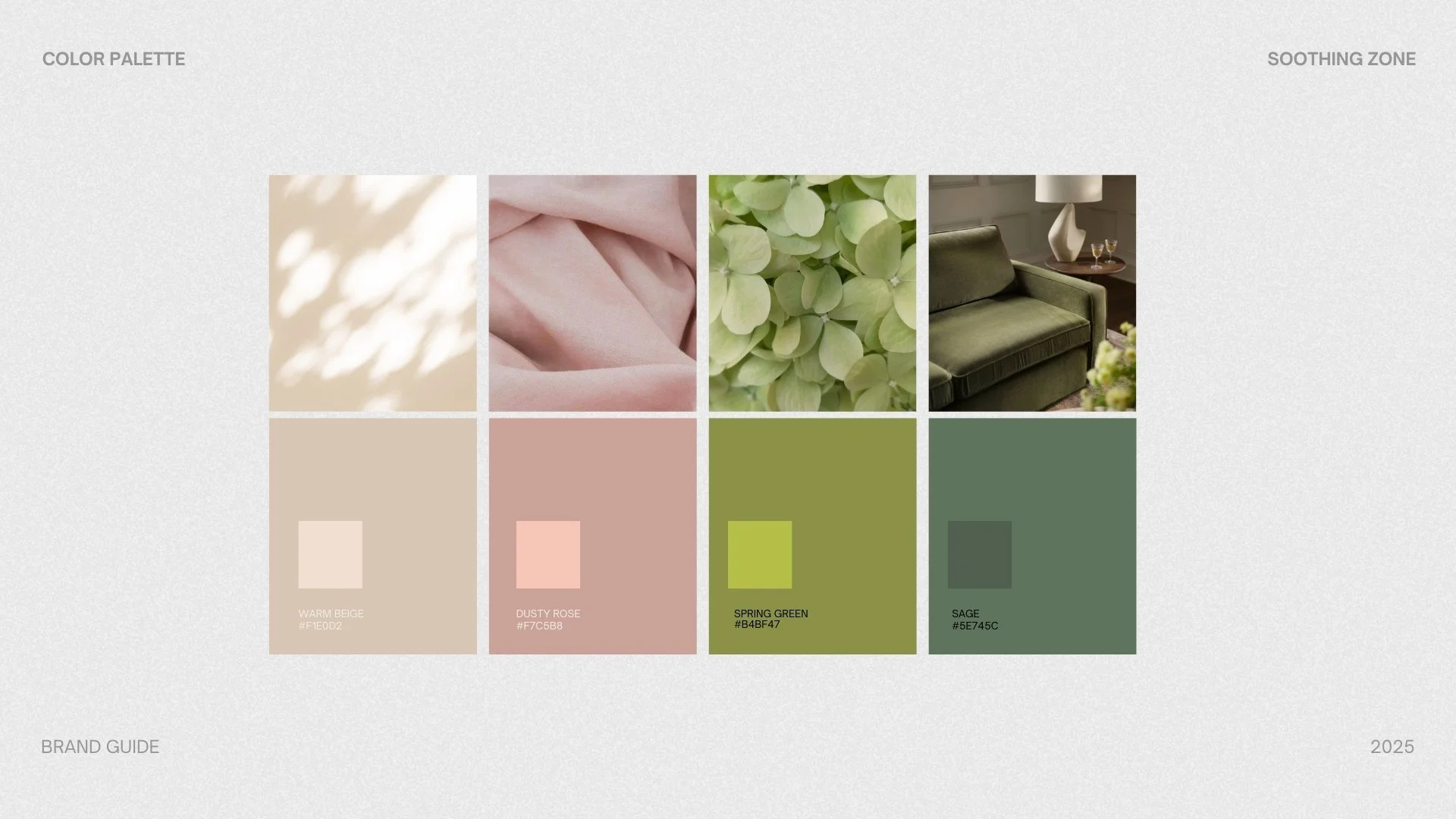
Color Palette
Neutral base tones (beige, soft sage, muted earth tones)
Low-contrast combinations to reduce visual tension
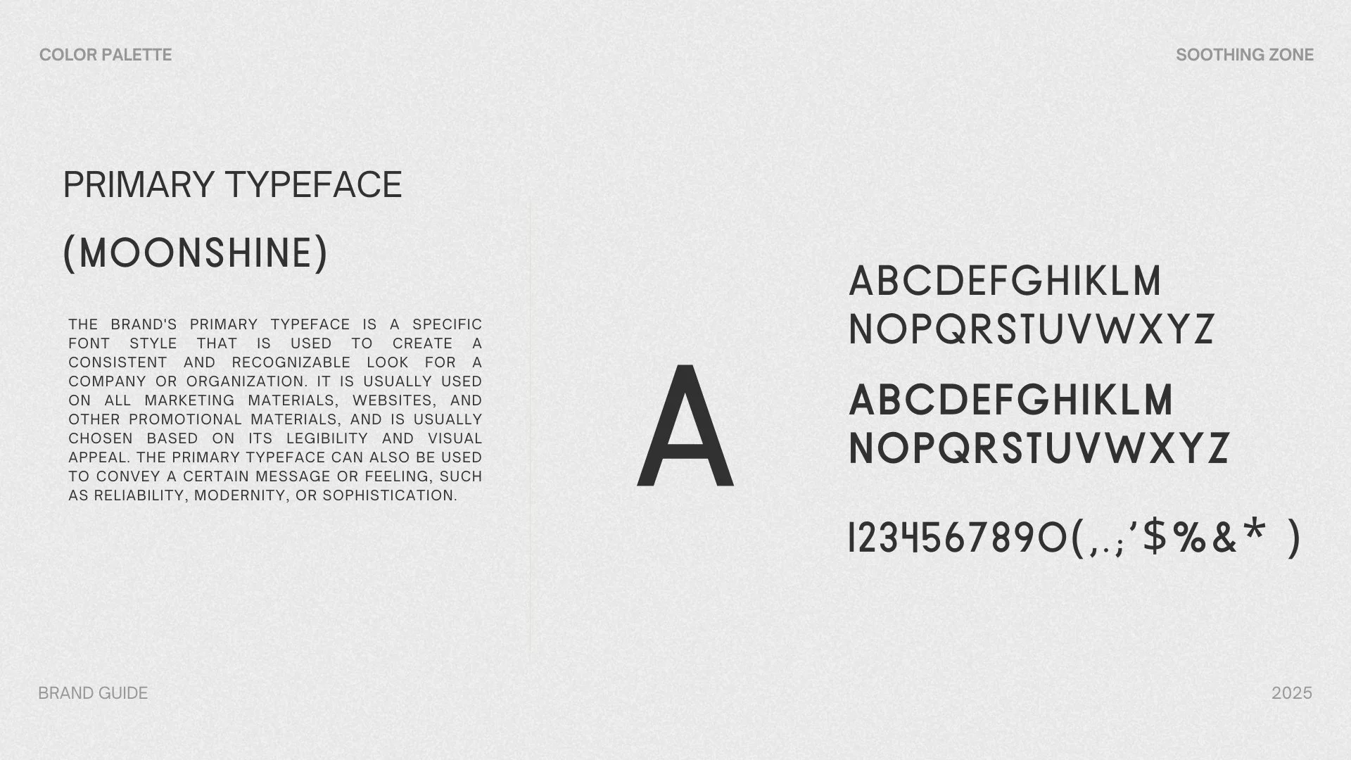
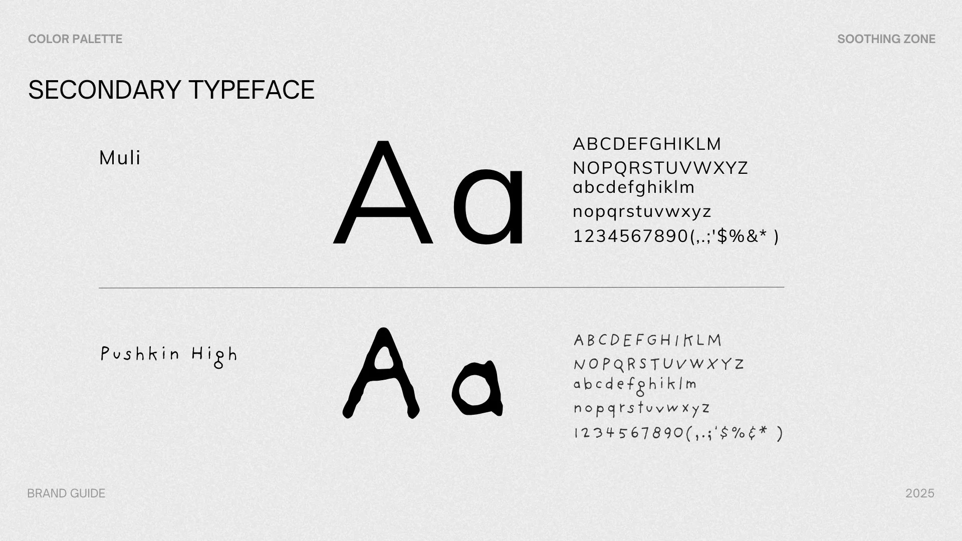
Typography
Clean, modern sans-serif typefaces
Balanced proportions and generous spacing to enhance readability and calm
Graphic Elements
Simple geometric shapes
Repetitive, rhythm-based layouts reflecting daily coexistence
Optional pet-inspired abstractions (ears, tails, silhouettes) expressed minimally
Tone of Voice
Gentle, observational, and grounded
Avoids instruction or authority; favors companionship and reassurance